When it comes to designing or renovating your home, choosing the right color palette is one of the most impactful decisions you’ll make. Color sets the tone, influences mood, and brings harmony to your space. Whether you’re building a custom home from scratch or refreshing a single room, the right combination of hues can elevate your interior design and reflect your unique personality.
At Patterson Development, we understand that creating a cohesive and beautiful space begins with the fundamentals, starting with color. With over 30 years of experience in luxury home construction and renovation, we’ve seen firsthand how a thoughtfully chosen palette can transform interiors into stunning, inviting environments. In this guide, we’ll walk you through key tips and considerations for selecting the perfect color palette for your home interiors.
1. Understand the Power of Color
Color is more than just decoration, it affects how we feel and experience a space.
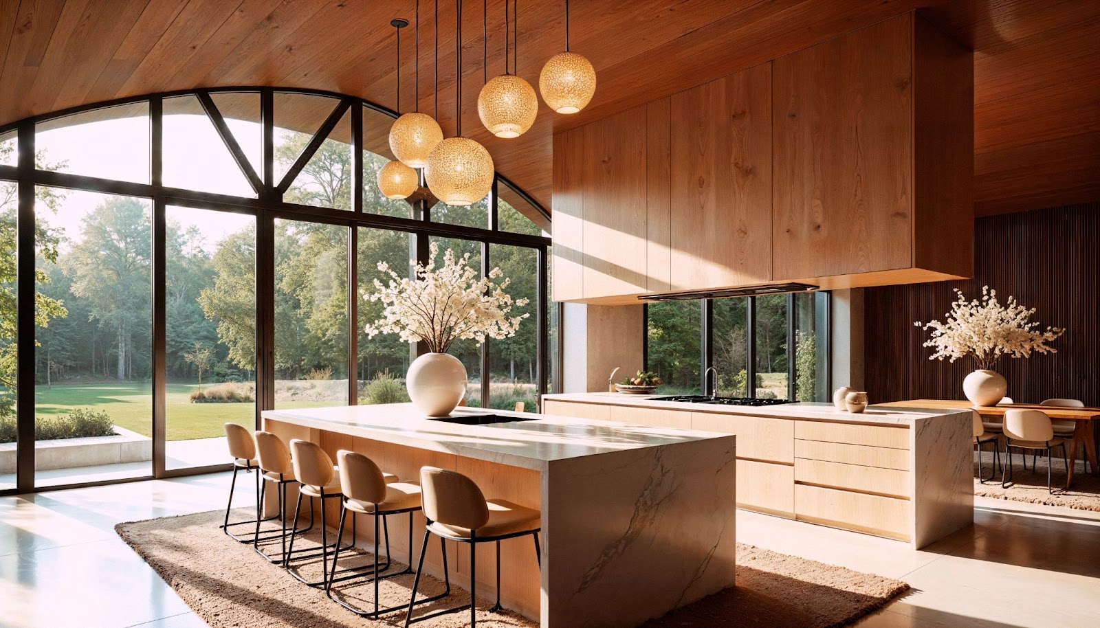
- Warm colors like red, orange, and yellow tend to energize and stimulate. They’re ideal for lively areas like kitchens, dining rooms, or family rooms.
- Cool colors like blue, green, and violet evoke calmness and serenity, making them perfect for bedrooms, bathrooms, or home offices.
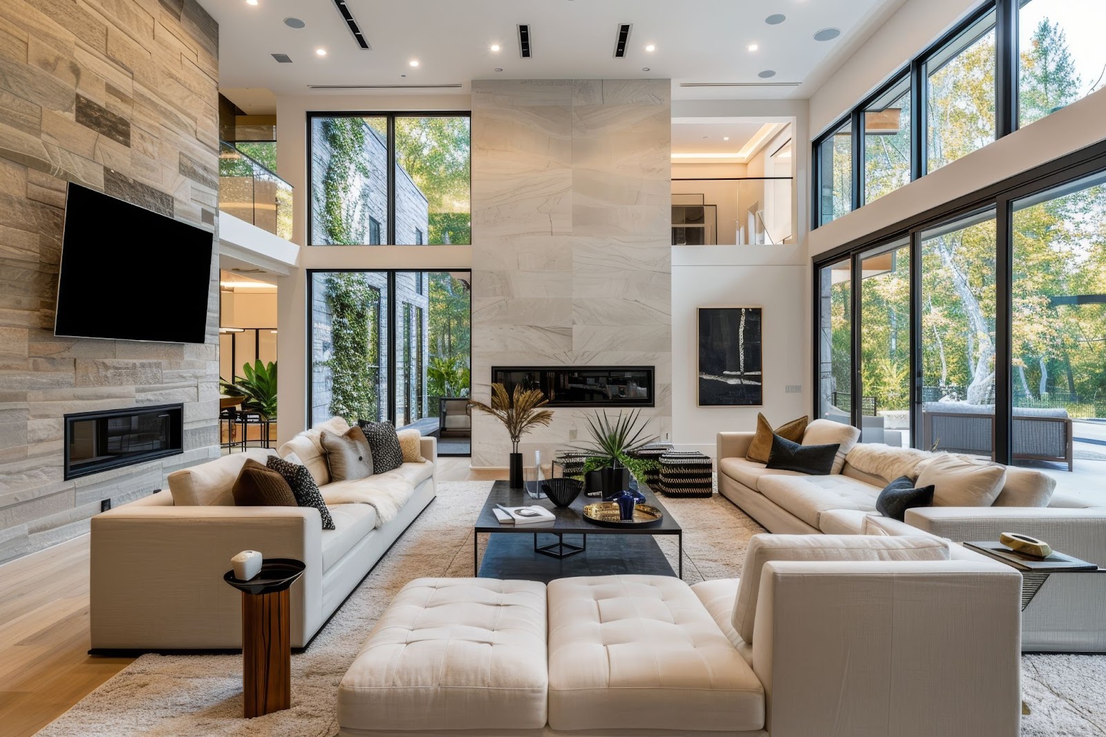
- Neutral tones such as white, beige, gray, and taupe create balance and flexibility, acting as a canvas that allows furniture, artwork, and accent colors to shine.
Before diving into paint swatches, think about the feeling you want to evoke in each room. Cozy and inviting? Light and airy? Sophisticated and moody? Your emotional goals should guide your palette choices.
2. Start with a Base Color
Every great interior color scheme starts with a strong foundation. Choose one base color that will anchor your design and be used throughout your home.
This could be a soft gray, a warm beige, or even a crisp white. Base colors often appear on walls, ceilings, or large furniture pieces and help create flow from room to room. For open-concept spaces, a consistent base color ensures harmony and avoids visual clutter.
Tip: Choose a base color that complements your flooring, cabinetry, and other permanent features.
3. Use the 60-30-10 Rule
A classic interior design principle, the 60-30-10 rule is a simple way to create visual balance:
- 60% of your space should feature the dominant color (walls, large furniture, rugs).
- 30% should be the secondary color (upholstery, curtains, accent chairs).
- 10% is for the accent color (pillows, artwork, décor accessories).
This rule keeps your design cohesive and allows bold or trendy colors to make an impact without overwhelming the room.
4. Consider Natural Light and Room Orientation
Light has a powerful influence on how colors appear. A soft gray may look crisp and elegant in a sunlit room, but dull and cold in a darker space.
- North-facing rooms get cooler, bluish light, opt for warmer tones to balance this out.
- South-facing rooms enjoy warm natural light, allowing more flexibility in color choices.
- East-facing rooms benefit from warm morning light but cooler afternoon shadows.
- West-facing rooms glow in the evening, warmer tones work beautifully here.
Always test paint samples on the wall and observe them throughout the day before committing to a color.

5. Draw Inspiration from What You Love
Great color palettes are often born from personal inspiration. Look to elements that already bring you joy:
- A favorite artwork or photograph
- A piece of furniture or textile
- Nature scenes, coastal blues, forest greens, desert neutrals
- Fashion choices, what colors do you feel best in?
These sources can help guide your color story and make your home feel authentically yours.
6. Stick to a Cohesive Theme
If your home has multiple rooms with different functions, it’s easy to end up with clashing styles. To avoid this, choose a cohesive color theme that runs throughout your home. This doesn’t mean every room must be the same color, but rather that each space should complement the next.
Consider:
- Using different shades of the same hue in various rooms.
- Keeping undertones consistent (all warm or all cool tones).
- Repeating a key accent color in small ways across multiple spaces.
This approach creates visual continuity and makes your home feel more connected.
7. Don’t Underestimate Neutrals
While bold colors have their place, neutral tones are the backbone of timeless design. Whites, grays, beiges, and greiges provide a clean backdrop and can evolve easily with changing trends or personal taste.
Neutrals also:
- Make rooms feel more spacious
- Highlight architectural features
- Provide a sophisticated, calming effect
To keep neutrals from feeling bland, layer different textures and materials, think linen curtains, natural wood, stone finishes, and plush textiles.
8. Play with Accent Colors
Accent colors are where you can get creative and inject personality. Whether it’s a jewel-toned velvet sofa, a dramatic navy-blue wall, or vibrant patterned cushions, accents add depth and excitement.
Trending accent colors in luxury homes include:
- Deep emerald green
- Navy blue
- Terracotta and clay
- Matte black
- Burnt orange
- Blush pink
These tones add richness and dimension, especially when paired with metallics like gold or brushed brass.
9. Be Mindful of Paint Finishes
The finish of your paint matters just as much as the color itself:
- Matte or flat finishes are great for ceilings and low-traffic areas but can be harder to clean.
- Eggshell or satin offers a soft sheen that’s ideal for living rooms, hallways, and bedrooms.
- Semi-gloss is perfect for trim, doors, and kitchens due to its durability and easy-to-clean surface.
- Gloss is typically used for dramatic accents but can highlight imperfections.
Choosing the right finish enhances the look and longevity of your walls.
10. Work with a Professional
While it’s exciting to choose your own colors, working with a designer or builder who understands the science of color and how it interacts with lighting, materials, and layout can make a world of difference.
At Patterson Development, we collaborate closely with homeowners to ensure that every design detail, including color, is intentional, stunning, and aligned with their lifestyle. From paint selections to finish choices, our team helps clients avoid common pitfalls and bring their vision to life with precision and style.

Your Home, Your Palette
Choosing the perfect color palette is a deeply personal decision, but you don’t have to do it alone. With the right approach, a clear design vision, and expert guidance, you can create a home that feels cohesive, elegant, and uniquely yours.
At Patterson Development, our custom home building and renovation services are rooted in craftsmanship, attention to detail, and a deep understanding of what makes a house feel like home. Whether you’re updating a single room or building your dream home from the ground up, we’re here to help you choose the perfect colors and finishes for a truly inspired interior.